
Introducing Aysnd’s New Brand Symbol, and the Reset That Got Us Here
When I joined Aysnd as Executive Creative Director this past January, one of the first things on my to-do list was to examine the Aysnd brand identity itself, and specifically the idea of a symbol to live alongside our wordmark. The team had explored a few directions before I came on, but nothing had quite clicked, and by the time I got there, Mickey and Carrie were genuinely asking whether a symbol was even necessary in the first place.
It was clear that the brand was at a tipping point, and what we did next was crucial.

A Little Historical Context
I've been working in design for fifteen-plus years, and I've known Mickey and Carrie for several years via our shared time together at a previous agency. I'd been watching them build Aysnd from the outside well before I came on board. I had a lot of context on the brand they were trying to create, the kind of work they wanted to do, and the ethos behind it, which made stepping into the ECD role feel less like learning a new company and more like getting to help shape something I'd already been rooting for.
So when I started working on the symbol, I was ready to hit the ground running and thought I had all the information I needed. The wordmark was already in great shape and not something we wanted to touch. The open question was whether a symbol could meaningfully add to it, or whether adding one would feel forced or superfluous.
Why Earlier Explorations Didn't Land
To Mickey and Carrie's credit, they'd resisted the temptation to just pick something and ship it. The earlier symbol explorations were thoughtful, but in that first year of Aysnd's existence, the brand was still figuring out what it wanted to be when it grew up, which made it nearly impossible to land on a mark that would still feel right today and years into the future. We had a rock-solid understanding about what Aysnd stood for, but not yet a shared visual vocabulary for it, and that gap is the exact thing that leads to endless swirl.
When I started my own exploration, I ran into the same wall. Everything I brought back was fine in a vacuum (and there were even a few directions we all genuinely liked), but every conversation made one thing come into sharp focus: the problem wasn't the design work; it was that we hadn't yet aligned on what the design was supposed to express.
Treating Ourselves Like a Client
Agencies are famously terrible at “self-care,” which is a little embarrassing for those of us who do this for a living. The reason isn't lack of skill or desire to make our brand the best that it can be. It's that we don't have time for the parts of the process that are non-negotiables for any paying client (workshops, alignment exercises, structured discovery), and we assume we already know ourselves well enough to wing it.
But we came to understand that to make this work, we had to be our own client. We booked a Figjam workshop with Mickey, Carrie, and me, and we treated Aysnd like any other engagement. What was the agency's first-year journey? How had it evolved? Where did we want it to go? What were our competitors and inspiration doing? It's the same process we'd walk a client through, and—shocker!—it worked just as well for us as it does for them.
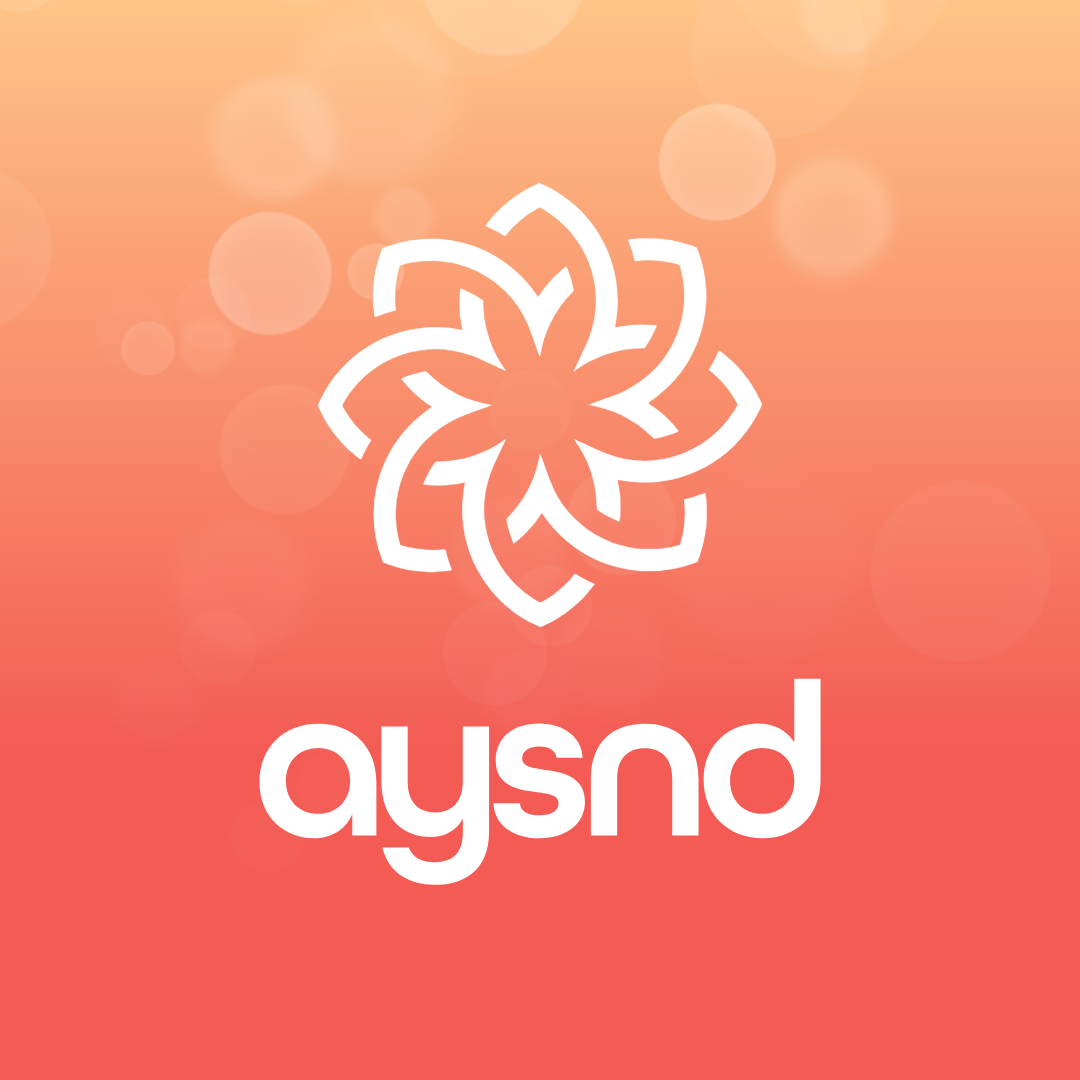
Somewhere in the middle of that workshop, the idea of a mandala-inspired symbol started rising to the top and making sense to all of us, which is usually a good sign.
Why a Mandala
In Sanskrit, mandala literally translates to circle. Across cultures and centuries, it has come to represent the universe, wholeness, balance, and the connection between all living things. It holds a lot of different meanings at once, which is something we wanted for our symbol: something that wasn’t too literal and allowed the viewer to interpret it in their own way.
The form communicates a few things simultaneously. The blooming flower-inspired shape speaks to growth and how we help our clients reach their potential. The petals overlap and intersect rather than sitting next to each other, which represents how we actually work; we're an extension of our clients' teams, not just an external vendor. The rotation of the petals gives the mark a subtle pinwheel motion, no beginning and no end, which is how we think about our own forward momentum and our clients'. And the overall geometry has a feminine, organic quality that we didn't want to hide, given that Aysnd was founded by two women and is built around the values they brought to the table.
How We Landed It
After the workshop, I took the mandala direction into a more refined round of exploration. When I brought the options back to Mickey and Carrie, the choice was unanimous—which, if you've done this as much as I have, you know is a rare treat.
"As soon as Amy put the mark in front of me, I knew it was the one. It captured everything we were trying to express as a brand: movement, growth, connection, and a natural sense of rhythm. As a designer, I was especially drawn to how it reflected patterns found in sound waves and nature, creating something that felt both intentional and alive."
—Mickey Winter, Aysnd CEO
The Work After the Decision
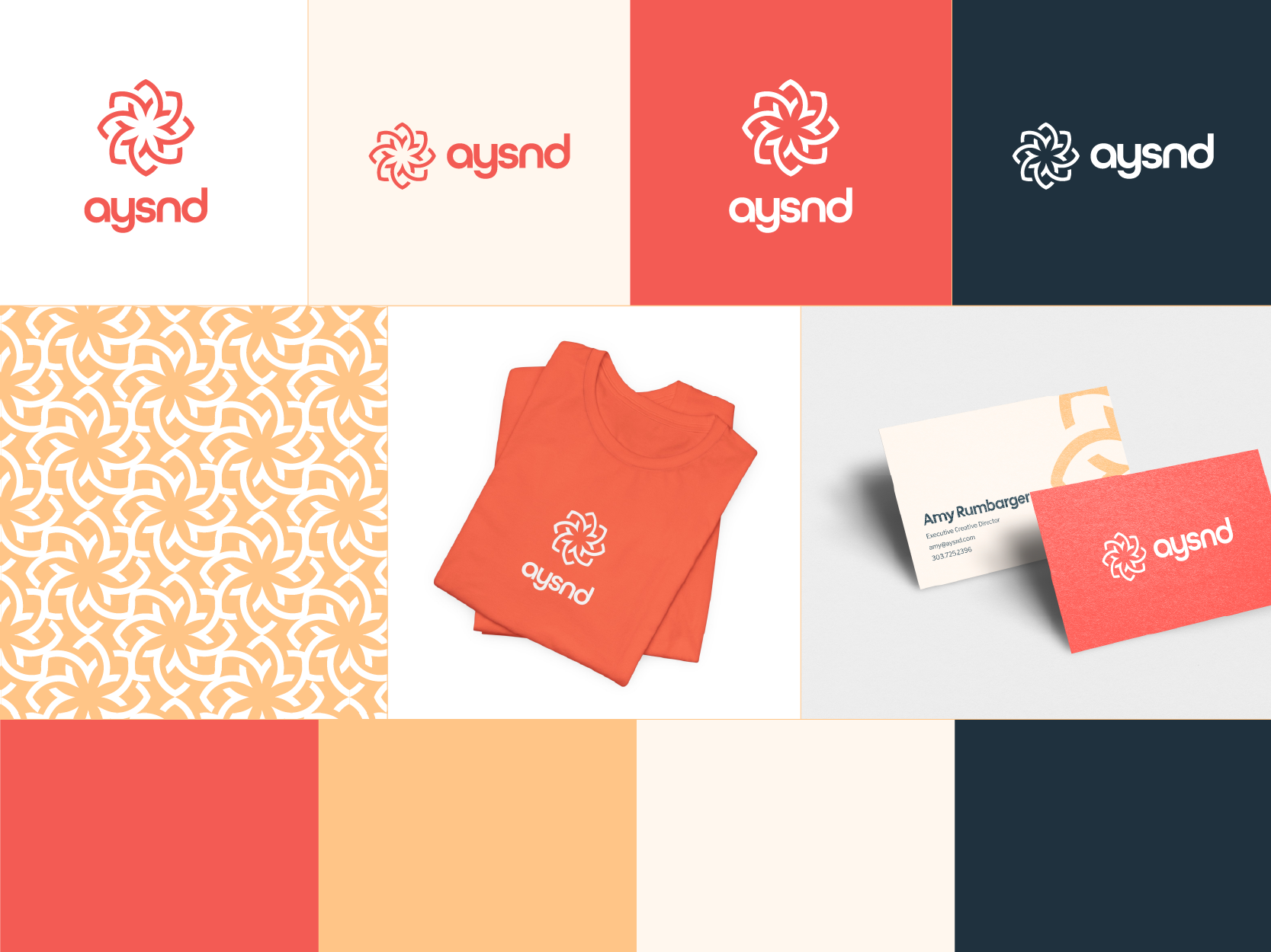
Choosing the symbol was the obvious part of the process. The invisible part was making it actually work alongside the existing wordmark, which we all loved. That meant fine-tuning the size, weight and spacing of the symbol so it would feel harmonious with the weight of the Aysnd letterforms, then pairing the symbol and wordmark together in every reasonable configuration to pressure-test the system.
The symbol project also went hand-in-hand with an evolution of our brand color palette, which I won't dwell on here except to say that coral is still the hero, with new warmer companions in blush and apricot, and a soft dark navy in place of black. The brand reads warmer now, which felt right for where we're heading.
If your brand is in its own moment of evolution and you're trying to figure out whether you need a symbol, a refreshed palette, or a fuller reset—that's the kind of work Aysnd does for the companies we partner with, and we'd love to talk.
When Your Business Evolves, Your Brand Should Too
If you're navigating growth, change, or a new chapter and aren't sure what needs to evolve next, we'd love to talk.